

Project Conception and Design
No matter what you project is, starting with a solid plan is a must.


How many great ideas for an application or piece of software have you had that never saw the light of day? If you're anything like me, you probably have a ton of them. In this day and age however, it's never been easier to spin up a user interface and actually bring those ideas to life.
In this series, we are going to walk through all the steps to take an idea and turn it into a fully functional web application with just a few hours work. The "build" and "deploy" parts of this series assume that you have at least some experience with Python or scripting, however this post about project conception and design is (programming) language agnostic.
The Motivation
People build software for all sorts of reasons. Often the motive is profit, but not always. Developers tend to be a creative bunch, and one of the ways they express that creativity is through personal projects.
For me so far, my experience building graphical user interface (GUI) applications has been mainly motivated by saving time, or increasing productivity in my business. Now there's nothing wrong with these motivations as such, the trouble for me is that these applications are; 1) quite ugly (they don't need to be pretty, they just need to work) and 2) rely on sensitive customer and business information to demonstrate their functionality.
I have plenty of experience building GUIs, just none that I can showcase as such. So my primary motivation for this project is to show that I can design, build and deploy a (pretty-ish) web application.
Understanding your motivations is critical for any project. Whenever you hit a crossroad, get stuck, or need inspiration - go back to your original motivation... why did you start this in the first place?
The Idea
A project to show that I can build and deploy a web app doesn't have to be complicated. Sure, it does need some functionality - but the key terms are "build" and "deploy", so long as the project ticks these two boxes, it's perfect.
The idea for the application we will be building in this series is based on a simple "productivity hack" that I use my phone for. This hack is an adaptation of the "Pomodoro technique", the idea of setting short timers (20 minutes) with short breaks (5 minutes) to manage larger chunks of time.
This requires me to set a 20 minute timer on my phone, then five minutes for a break, then repeat.
It doesn't sound like much, but doing that three times per hour, eight hours per day and five days a week is really quite tedious. Far too many touch points for something that is supposed to save you time/make you more productive.
As a developer, the trouble I found with this technique is that when I am "in the flow" and focused entirely on the task at hand - taking a short break every 20 minutes can be detrimental to my focus. On the other hand, there have been plenty of days where I have entirely lost track of time trying to troubleshoot a problem.
Rather than "tracking time", I adapted the technique to help me be "mindful of time passing". So instead of having to physically reset the timer every 20 minutes, a simple "ding" every 20 minutes will remind me of time passing without having to switch context/focus.
Core Features/Functionality
Now that we have a general idea of the application we will be building, let's get clear about the features it must have.
At its core, this application has one basic function... make a noise and/or alert the user every x minutes.
For a developer, this functionality could be simply be packaged as a CLI (command line interface) application. However, if we really want to build an application that can be used by the general population - we must consider the user experience (UX) and user interface (UI).
UI Features/Functionality
User interface (UI) features are those which help to enhance the user experience, but not necessarily required for its core functionality to work. Before committing to a bunch of unnecessary features, we really need to perform some cost/benefit analysis when considering features to ensure we direct our energy where it is needed.
For example, allowing the user to set a custom period of time isn't strictly required for this application to work. However, giving users the flexibility to set a custom time will vastly increase the potential use-cases for this application. The relatively small cost of adding this feature is far outweighed by the additional value it provides to the user.
Another example for this project, displaying a timer to show the "total time elapsed". Again, this is not strictly required for the application to function, but given this is a "timer" app - users might actually expect to see a timer. Sometimes it might be necessary to include a feature simply because the user expects it.
The Design
One thing I've learned over the years working with clients and colleagues, is that images can convey ideas far more effectively than words alone.
Take the following description for example...
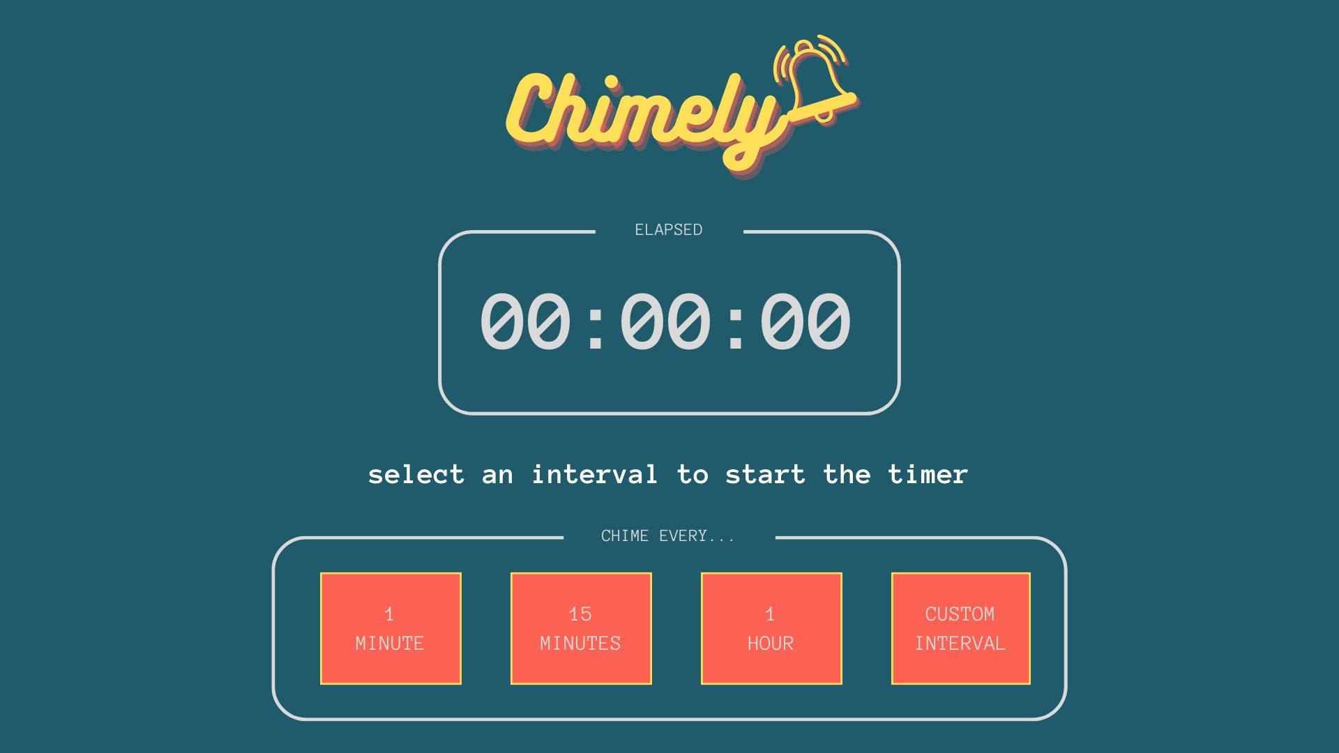
"a single-page web application, with a darkish-green background, logo at the top of the page with a caption below it, a timer showing how much time has passed, and it will have some buttons to start the timer and select an interval".
Every single person who reads that description will have their own, unique vision of how that might actually look. Even if you wrote the description, how you envision the outcome might change from day to day. Regardless if you are working in a team, for a client or on a solo project - having a graphical "blueprint" to work from will remove a lot of guesswork from future decisions.
You don't need to spend days, or even hours on this process - a five minute sketch on the back of a napkin might be all you need to get the juices flowing. Starting with a simple sketch or wireframe will get you in the headspace of the user. You will begin thinking about how the user will interact with the application and how they might expect it to function.
For this project, we can define the following:
It should be pretty (nice logo and colour palette, well-defined sections, easily readable)
Function with a minimal number of clicks
Have a large timer to show elapsed time
Allow the user to set a custom timer interval
Give the user the ability to stop the timer
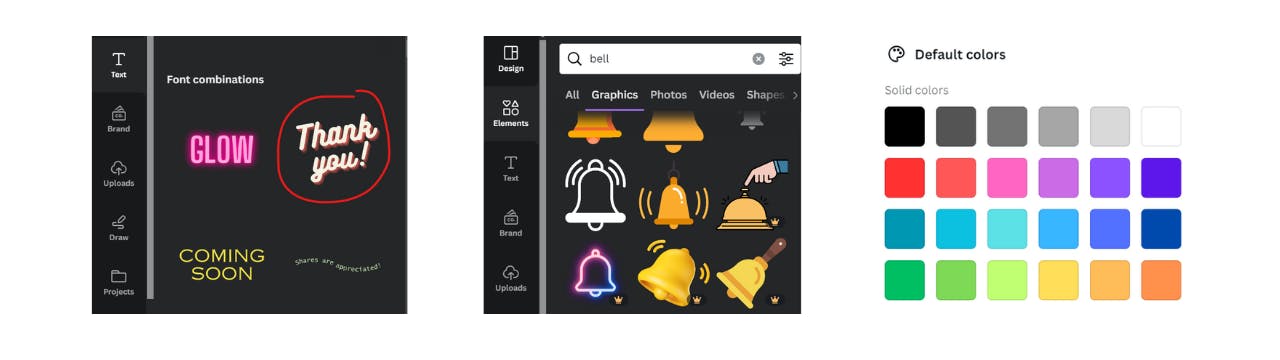
Often I find that a sketch on paper is enough to get a vibe for the layout and how everything will interact. For this project however, with such an emphasis on building something "pretty" - I wanted to experiment with different combinations of colours and fonts, so I took to Canva to start playing around with ideas.
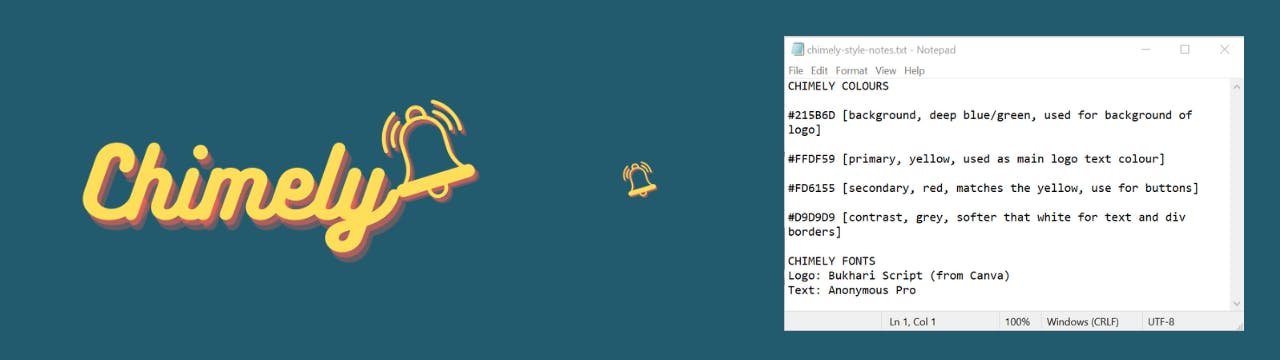
No more than two hours later, I had come up with a name for the application (yes, as I was playing around with logo ideas, I chose the name because it looked good in the font and style I liked), created a logo, created a favicon, chose a colour palette, chose a primary font-family and had a full-page coloured wireframe as a blueprint for design.
That might seem like a lot of output for just two hours of work (I do have quite a bit of experience whipping-up logos, graphics, websites etc.), but I can tell you it's not because I'm some kind of graphic design guru - it's because I have learned to not get hung-up on the small stuff.
Like a particular colour? Great. Note it down, then move on.
Let's take a look at the wireframe below, then walk through the steps to achieve it...
I start with a blank 16:9 "Presentation" template in Canva, and the first goal is to arrange the general layout and structure of the interface. Don't get too worried about fonts or colours at this stage, even the logo can be a simple placeholder for the time being.
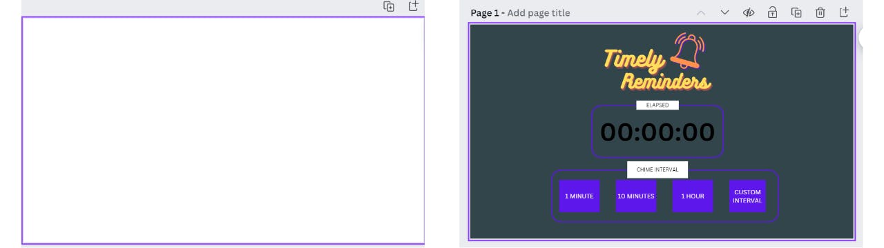
With just three basic sections; logo, timer, input buttons - you can start to see how everything will take shape together. As you walk through the user experience, it raises questions like; "what happens to the buttons when a timer is started?" or "how does the user set a custom interval?".
In terms of aesthetics, obviously the colour palette needs some work and the logo could be improved, but all in all, this first draft would be ample to get started with a basic app like this.
However, this project is supposed to be pretty - so I spent some more time on the name and logo, then I played with the colour palette.
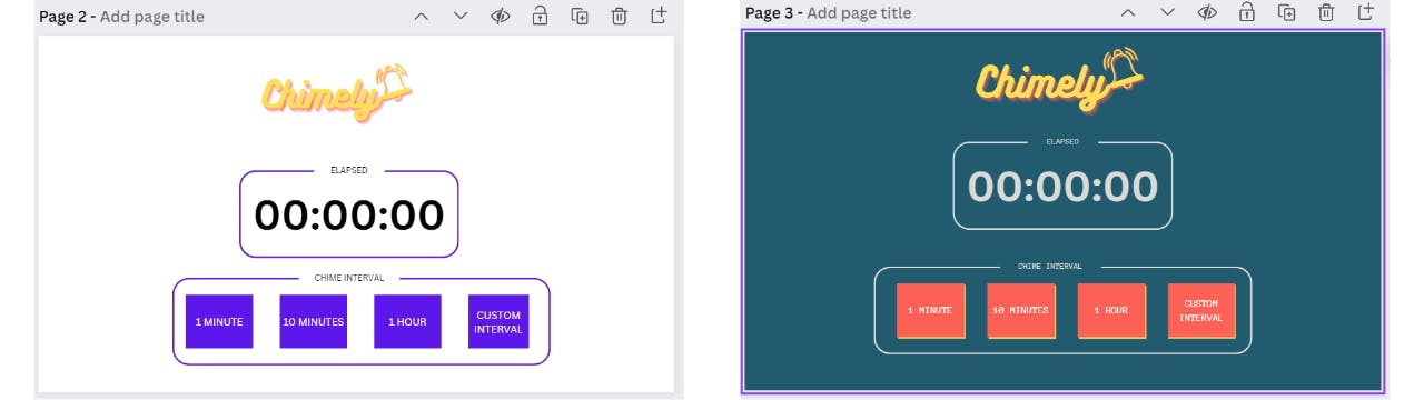
There's just one quick point to emphasise about making the logo and choosing the colours... Canva has a team of awesome creatives who already know how to pick colour palettes and jazz up fonts. There's no need to reinvent the wheel - use one of their examples, add your own text, add an icon, play around with the colours and you're done. This doesn't have to take long.
Once you've landed on a style and design you're happy with, it's a good idea to note down the fonts and colours used into a kind of "style guide". It doesn't have to be fancy, just a plain text file will do the trick.
This will come in handy when it's time to write the CSS file for the project. Save a copy of your logo and favicon, and if necessary, download any font files you want to include in the project.
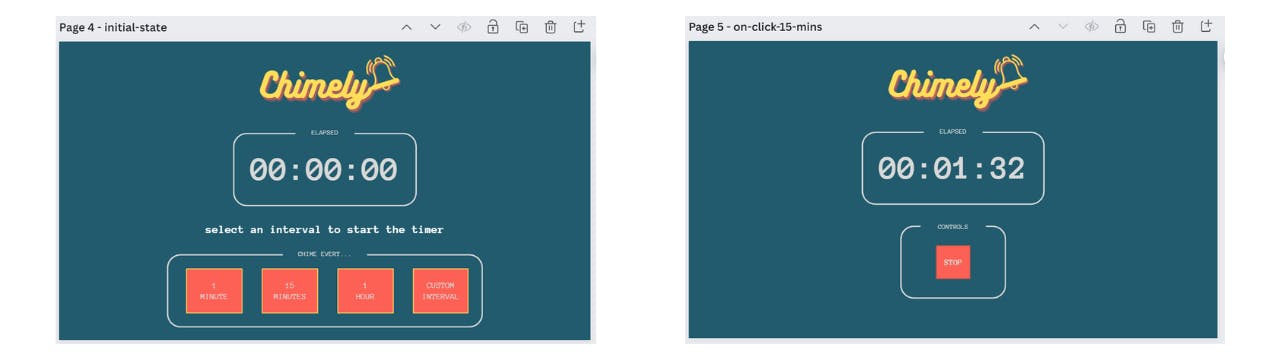
At the end of the concept and design phase, the project is starting to come to life. We now have two wireframes to represent two of the three "states" the app can be in. We've created some graphical assets (logo and favicon), and we also have a text document to act as a style guide for the project. Now we're ready to start cooking.
Summary and Next Steps
In this post we've taken the first steps for conceptualising and bringing an idea to life. Although we haven't built anything yet, getting an idea out of your head and into a plan is half the battle. Following that plan to reach the desired outcome is really just a matter of procedure.
Catch the next post in this series where we will pull this all together and build a fully functioning application based on the design and concept we've just defined. Whether you're a seasoned Python developer, or never heard of Python before - you'll be blown away by the simplicity of building functional user interfaces with Taipy. See you there!